Seattle Aquarium
Inspiring curiosity through ocean education and conservation
Summary
Mission
- Enhance visitor engagement and learning through interactive experiences, strengthening the aquarium's educational impact and public appeal
- Ensure accessibility and intuitive navigation for a diverse audience
- Balance storytelling with exhibit content to guide users through a narrative journey
Impact
- Produced a kiosk immersive experience that guides visitors through a cohesive story while allowing flexible exploration
Context
- 9-week academic UX/UI project building an interactive kiosk for Seattle Aquarium's Ocean Pavilion
- 3-person team
My Role
- Lead UX/UI Designer and Researcher
My Contributions
- Implemented user-driven solutions to enhance accessibility and usability
- Led Wireframing and prototyping
The Company
The Seattle Aquarium recently expanded with the addition of the Ocean Pavilion featuring The Reef, a vibrant tropical exhibit home to over 100 tropical species.
Objective
Our goal was to design an immersive, accessible digital kiosk that presents the story of Seattle Aquarium's newest addition to adult visitors that also supports parent-led learning for younger audiences.
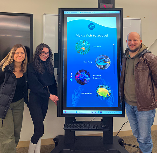
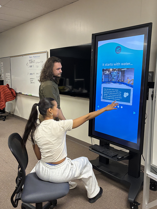
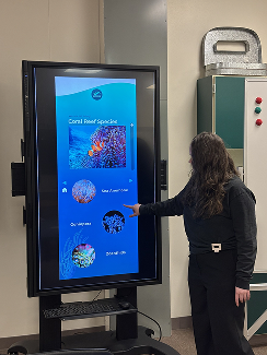
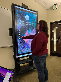
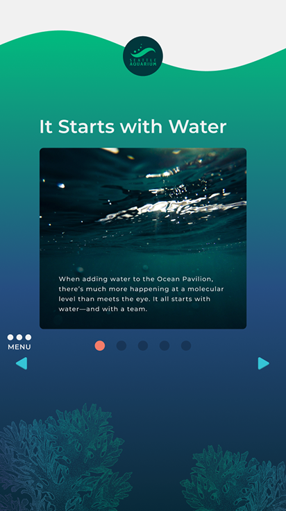
Final Prototype
Design Challenge
The greatest challenge was designing within the constraints of a large-scale, portrait-oriented kiosk, ensuring accessibility, readability, reach, and visual hierarchy for a wide range of adult users.

Key Decisions
UI Design
- Design interface to align with Seattle Aquarium's existing brand system
- Maintain consistent layout patterns to support predictable navigation and reduce cognitive load
- Develop a clear, recognizable menu icon to encourage exploration without overwhelming the interface
UX Design
- Introduce a pop-up navigation menu to give users greater control while preserving screen space
- Use subtle, ocean-inspired interactive elements to reinforce context without distracting from content
- Integrate user-controlled elements to support self-paced learning within the experience
Ideation and Prototyping
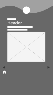
Lo-fi wireframe of
introductory page
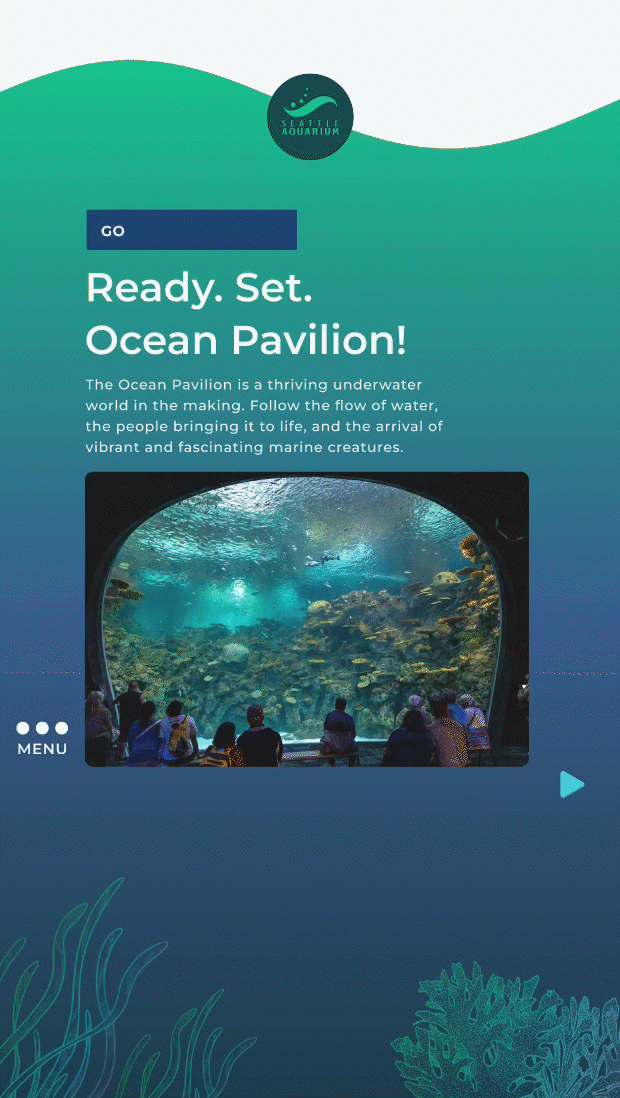
Final version of
introductory page
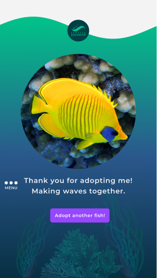
Adopt-a-fish
confirmation page
User Testing and Feedback
Users engaged both up close and from six feet away, standing or seated, and provided the following feedback:
Navigation & Layout
- Replace linear navigation arrows with a persistent, page-level menu
- Reposition the Home button to improve discoverability
- Assess vertical scrolling pages and remove if unnecessary
Visual & Text Clarity
- Update inactive pagination dots to a distinguishable dark blue
- Increase leading and tracking for white text on dark backgrounds
User Guidance
- Add clear visual signifiers (icons, labels, affordances) to guide users
Iteration and Compromises
Based off of Feedback

- Incorporated user feedback while maintaining usability by adding a pop-up menu bar on each page for flexible use, positioned icon above the left navigation arrow for convenient access
- Kept hand-height navigation arrows to guide users through a story-like journey, complemented by a pop-up menu for flexible navigation
Outcome
Our prototype gained internal support at the Seattle Aquarium!
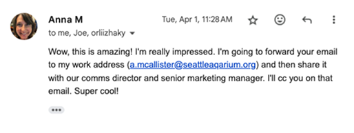
Senior Copywriter, Seattle Aquarium
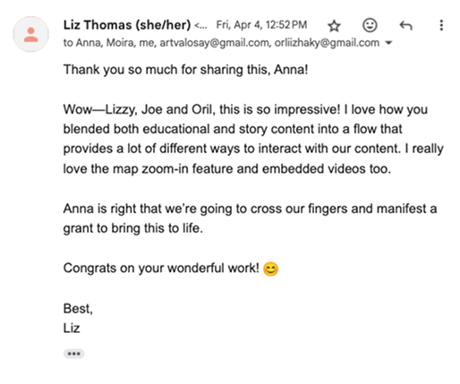
Director of Comms and Content, Seattle Aquarium
The project provided insights on designing large-scale experiences, enhancing accessibility, and targeting audiences, helping future kiosks boost engagement and educational impact.
Next Steps
Iteration
- Conducted additional research to uncover further pain points and developed alternative user flows to improve usability
Mobile Version
- Add a scavenger hunt feature to make the experience interactive, engaging, and accessible anywhere in the aquarium
Community Engagement
- Engage with the community through user interviews, A/B testing, heat map analysis, and user flow testing to validate design decisions
Design System
- Enhance the design system to achieve greater visual cohesion and consistency across screens