Summer Camp Scout
Bringing summer camp options together for easy comparison
Summary
Mission
- Drive user retention and engagement to grow platform loyalty and maximize active participation
- Improve the camp search user flow through user-led research
- Leverage user insights to improve web and mobile experiences
Impact
- Clarified the camp search experience with tested usability improvements
- Improved user retention and engagement by introducing familiar, user-tested features
- Balanced stakeholder and parent needs by maintaining camp ads without disrupting search
Client
Summer Camp Scout
Seattle, WA
WebsiteMy Role
- UX/UI Design and Research Volunteer
My Contributions
- Led user research with parents and camp organizations (guerrilla testing, user interviews, and surveys)
- Drove iterative wireframing and prototyping for continuous design improvement
- Conducted research analysis through journey mapping and SUS
The Company
Mobile site redesign, 2026
A website dedicated to helping parents and caregivers find and explore summer camps through an intuitive search engine.
The Problem
Flexibility and Efficiency of Use
Users struggled with the original design. Key features were non-intuitive, and users' search results were hidden beneath blue camp advertisement cards, slowing tasks and creating confusion.
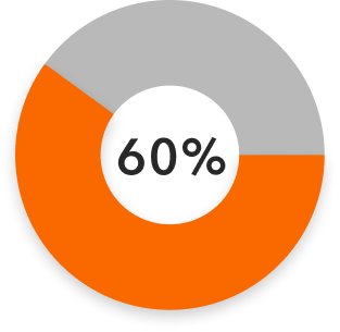
User research revealed that 60% of parents wanted more refined filters and found promoted camp ads disruptive to their search experience.
Design Challenge
With so many summer camp options and limited time, parents and caregivers often struggle to find the right fit for their child.
How might we streamline the camp search process so users can quickly and confidently find the best-fit camps, while still meeting the needs of organizations who pay to promote their camp ads?

Key Decisions
UI Design
- Redesign ad cards with interactive features to increase engagement and help users quickly find relevant camps
- Increase iconography for better accessibility and provide clear signifiers when navigating the site
- Refine text and layout to improve readability, making it easier for parents to scan and compare options
UX Design
- Create a loading animation to provide visual feedback and reduce user uncertainty during camp searches
- Add interactive category tagging for clearer navigation and help users filter camps efficiently
- Prioritized user search results over top-heavy ads to reduce confusion and help users find relevant camps faster
Ideation and Prototyping
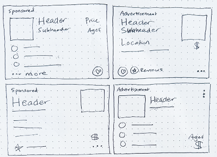
Camp and Camp Provider Card wireframe sketches: ideating on placement and balance of added interactive features
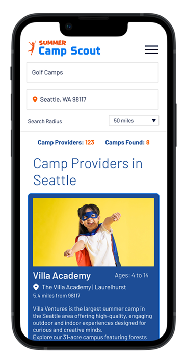
Original mobile version 2024
- Limited features
- Hierarchy and readability issues
- Ads at the top of search results once results appear
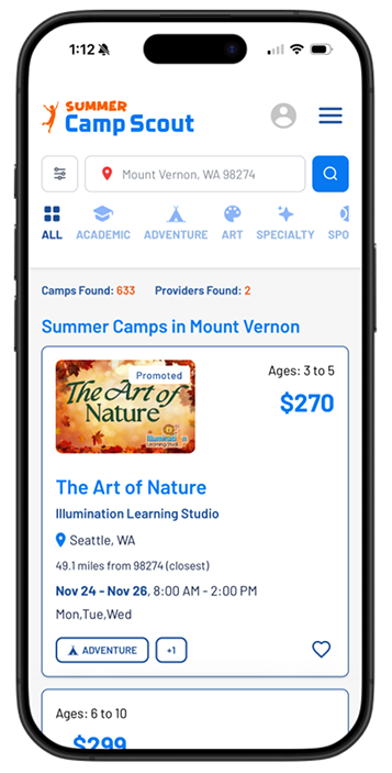
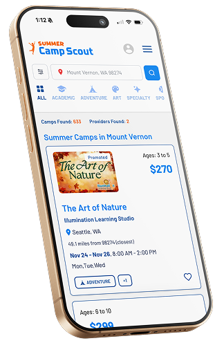
New mobile version 2026
- Prioritizes the user's specific search results at the top of the list
- Tagging system with visual category prompts for quick filtering
- Interactive features
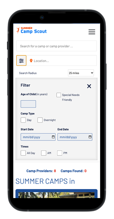
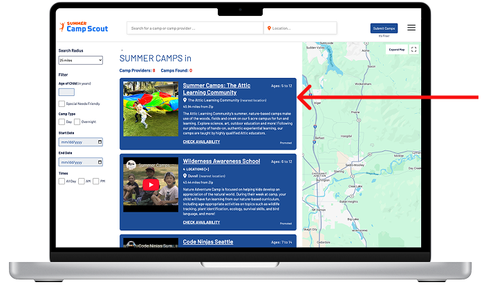
Original mobile version 2024
- Filter menu pushes results below the fold
- Less filtering options
- No affordances to launch search or to clear filters
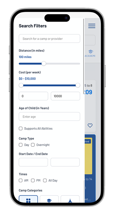
New mobile version 2026
- Filter scrolling overlay maintains visibility of the home page while preserving the user's scroll position
- Visual prompts such as camp categories, "supports all abilities", price and distance range slider, included to increase user engagement
Outcome
Revisions based on user insights made the website more engaging and accessible. Paid camp advertisements remain visually distinct, but a new tagging system allows ads to be filtered alongside search results, reducing confusion. Most advertisers supported this feature. Further testing is still needed, but these iterations improve usability while building user retention and trust in the business.
Next Steps
A/B Testing:
- Compare old vs. new layout to evaluate usability and engagement differences
Guerrilla Task Completion Testing:
- Ask users to search for and save specific camps on the new version
- Compare task completion metrics to previous testing results
Card Sorting:
- Have users organize the camp search flow to identify intuitive structure of information architecture
User Interviews and Surveys:
- Gather qualitative insights on first impressions and navigation experience