Starbucks Mobile App
Connecting customers to their drinks with ease
Summary
Mission
- Boost order efficiency by 50%+ to elevate customer experience, attract more users, and strengthen brand reputation
Impact
- Increased discoverability of the "Customize" button, reducing user confusion
- Reduced unnecessary scrolling and improved overall page usability
- Enhanced visual hierarchy and clarity through better button contrast
- Streamlined the customization workflow, making product updates quicker and more intuitive
Context
- 9-week academic UX/UI project centered on mobile app usability, using AI in the prototyping phase
- 4-person team
My Role
- Lead UX/UI Designer and Researcher
My Contributions
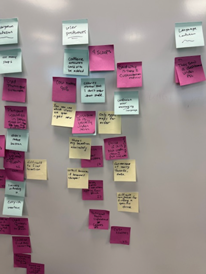
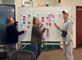
- Led user research (guerrilla testing and questionnaires)
- Executed wireframes, mid-fidelity, and AI prototype
- Derived research insights through journey mapping and user flows
- Developed design system and style guide with UI improvements
The Company
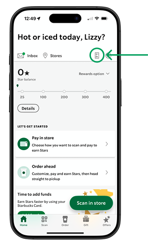
Starbucks' widely adopted mobile ordering app streamlines ordering and pickup for customers, effectively driving a significant portion of their transactions.
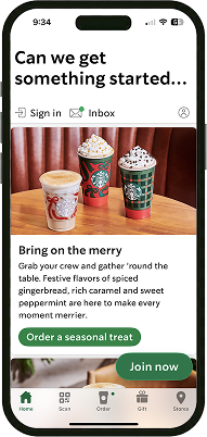
Starbucks app (2025)
The Problem
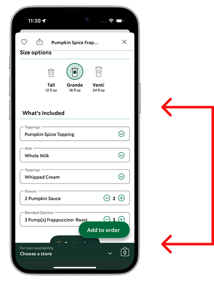
Users were asked to order a Venti Pumpkin Spiced Frappuccino with extra Frappuccino chips.
Ultimately, users were most confused on the product page. The "Customize" button was low-contrast, matching the footer color, and located far down the page, and the initial "What's Included" list gave users the impression that those were the only options they could update.

Average time to locate
the "Customize" button
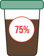
75% of users had friction
finding customize button
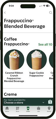
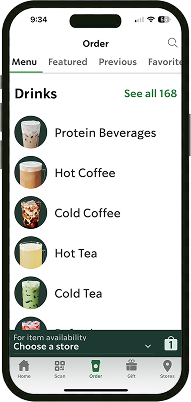
Other Reoccurring Themes of Friction
- Home page
- Map / store locator
- Price not listed
- Menu categorization
- Unrecognizable icon
- Inaccurate calories
Design Challenge
How might we help users more intuitively locate and customize drinks to complete orders more efficiently?

Key Decisions
UI Design
- Streamline customization flow by moving "What's Included" into the customization window, helping users adjust drinks quickly
- Relocate the "Customize" button higher for faster discovery and reduced frustration
- Categorize customization options into "What's Included" and "Extras" to improve clarity and confidence
UX Design
- Clarify visual hierarchy and layout to guide users through the ordering flow
- Enhance contrast of the "Customize" button for better visibility
- Organize customization content visually to make options easy to scan
- Update Order History icon for better recognition, aligning the interface with familiar real-world cues
Ideation and Prototyping
Design Refinements from User Testing: Home Screen
Current
With UI Improvements
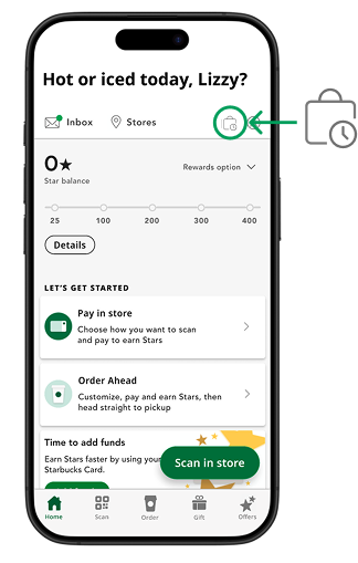
- Users couldn't recognize current icon's purpose. We enhanced the "Order History" button with a simplified, more recognizable image to improve visibility and user recognition
- Consistent with current iconography outlined style, no fill, same shopping bag image
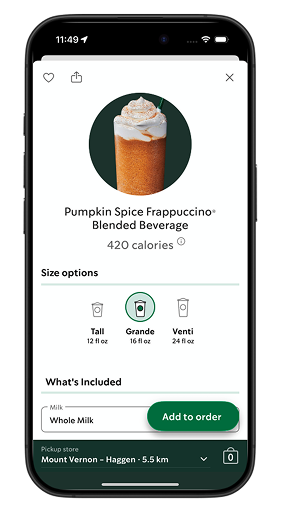
Design Refinements from User Testing: Product Screen
Current
With UI Improvements
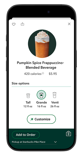
- Dynamic pricing: Update cost as users select sizes to support informed decisions
- "Customize" button placement: Reduces scrolling and highlights primary actions for efficiency
- Moved sticky "Add to Order" button. Reduces distraction and improves focus on customization
- Robust Instant "Add to Order" button. Ensures the primary action is always accessible
- Increased footer height. Improves spacing, alignment, and tap accuracy for easier interaction
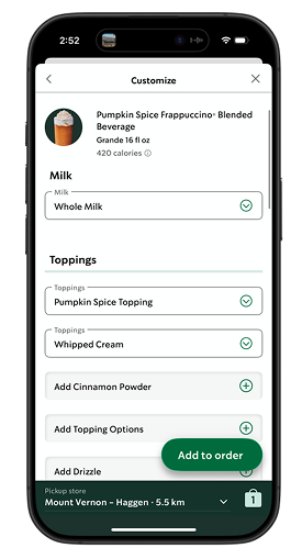
Design Refinements from User Testing: Customize Screen 1/2
Current
With UI Improvements
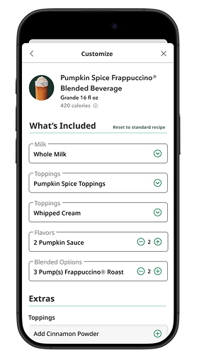
- Added divided "What's Included" and "Extras" sections to clearly present key information and group customization options
- Increased header size to improve visual hierarchy and grouping
- Added "Reset to Standard Recipe" button at the top to reduce scrolling
- Increased dropdown label size to improve readability
Design Refinements from User Testing: Customize Screen 2/2
Current
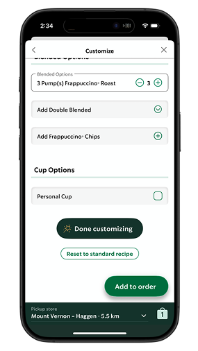
With UI Improvements
- Updated "Done Customizing" button to matches the "Customize" button styling for visual consistency
- Removed duplicate original recipe drop down to keep recipe and "Extras" sections distinct for clarity
- Removed outline from "Reset to Standard Recipe" button to simplify visuals and strengthen hierarchy
We used Figma's AI tool to quickly generate the prototype, saving time for iterating on ideas and design systems while focusing on user data analysis. We faced constraints due to limited AI credits and occasional AI hallucinations.
Outcome
Based on our previous findings...

Average time to locate the "Customize" button
Reported friction due to confusing placement of customize button
0 out of 5 recognized order history icon
Based on our new findings...


Average time to locate the "Customize" button
Participants still struggled to locate Frappuccino Chips on customization page
2 out of 5 recognized order history icon
Relocating the "Customize" button improved task completion speed and flow. The Frappuccino chips topping categorization and Order History icon still caused some confusion, highlighting areas for further testing and iteration. Overall, ordering efficiency has improved by 80%, suggesting that targeted design adjustments can meaningfully enhance user experience and inform future iterations.
Next Steps
Refine Figma Make Prototype
- Build out entire ordering user flow to replicate entire app experience for future testing
Card Sorting
- Conduct a card sort where participants organize items in the customization section, including Frappuccino chips
A/B Testing
- Brainstorm more order history icon ideas, and conduct A/B testing to assess what is most recognizable